
Choosing The Right Color Scheme For Your Pro Family Photos

Introduction
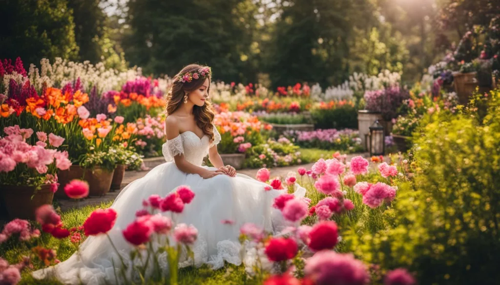
Family photos are treasured keepsakes, but choosing the right color scheme can be daunting. Did you know that a harmonious palette not only enhances visual appeal but also sets the mood for your pictures? This blog post will provide insights into choosing optimal color schemes for professional family photos and help you avoid common pitfalls while doing so.
Let's dive in and discover how to make your next photo session a vibrant success!
Key Takeaways
- Choosing the right color scheme for your professional family photos can enhance visual appeal and set the mood of the pictures.
- Some popular color schemes for family photos include olive green and black, denim, peach, and blue, red gray and mustard yellow, pink tan and cream, and copper rust and veiled rose.
- When choosing a color scheme, consider factors such as the setting/location of the photo shoot, colors that flatter everyone's skin tones, coordinating clothing choices, finding inspiration in other family photos while reflecting your personal style.
- Avoid patterned colors or neon clothing in family photos as they can be distracting. Also avoid being too matchy-matchy or overloading contrasts to create a more natural look.
Best Color Schemes for Family Photos
When it comes to choosing the best color schemes for your family photos, consider options like olive green and black, denim, peach, and blue, red, gray, and mustard yellow. pink, tan, and cream or copper rust and veiled rose.
Olive green and black
One striking yet underutilized color scheme for your family photos is olive green and black. Making a bold choice that also exudes elegance, this color combination adds depth to your images while allowing each member of the family to stand out.
The earthy tones of olive green bring warmth, creating an inviting atmosphere in the photo. On the other hand, black acts as a neutral backdrop that emphasizes details and highlights features beautifully.
A hint of gold accessories can add some sparkle and balance between both colors, resulting in chic coordinates that look fantastic regardless if you're shooting indoors or outdoors. This appealing palette holds its own throughout various seasons—ensuring your precious moments shared together always shine through timelessly!
Denim, peach, and blue
Denim, peach, and blue is a gorgeous color combination that works wonderfully for family photos. The denim adds a cool and relaxed vibe, while the peach brings a touch of warmth and femininity.
The blue ties everything together with its calming and soothing effect. This color scheme is perfect for outdoor family pictures as it complements natural surroundings such as beaches or parks.
When choosing this color scheme, keep in mind everyone's skin tones. Denim tends to be universally flattering, while peach can bring out the rosy undertones in lighter complexions. Blue works well on almost anyone and can make eyes pop in photos.
To enhance visual harmony, coordinate clothing choices by mixing different shades of these colors within each outfit.
For grandparents who may prefer more timeless looks or have concerns about fashion trends, denim paired with soft pastel peaches creates an elegant yet contemporary look that will stand the test of time.
Additionally, adding accessories like scarves or hats in complementary shades can add depth and interest to the overall ensemble.
Red, gray, and mustard yellow
Red, gray, and mustard yellow are a stunning color combination that can bring a unique and eye-catching look to your family photos. The vibrant red adds a pop of energy, while the cool gray provides an elegant backdrop.
Mustard yellow serves as a warm accent color that complements both red and gray beautifully. This color scheme works well for outdoor photo shoots, especially during the fall season when nature's colors align with these shades.
It's important to remember to choose clothing in these colors that flatter everyone's skin tone and coordinate well together. By incorporating this dynamic trio into your family photo outfits, you'll create a visually appealing composition that truly stands out in your collection of cherished memories.
Pink, tan, and cream
Pink, tan, and cream are a beautiful color combination for your pro family photos. These soft and feminine tones create a warm and cozy atmosphere that is perfect for capturing those precious moments with your loved ones.
The pink adds a touch of sweetness, while the tan provides a neutral base to balance out the palette. Cream ties everything together, creating a cohesive look that is both timeless and elegant.
Whether you're posing outdoors or in a studio setting, this color scheme will ensure that everyone looks their best and stands out against the backdrop. So go ahead and dress your family in shades of pink, tan, and cream for stunning photos that you'll cherish for years to come.
Copper rust and veiled rose
One beautiful color scheme option for your pro family photos is copper rust and veiled rose. These warm, earthy tones complement each other perfectly and create a cozy and inviting atmosphere in your pictures.
Copper rust adds depth and richness, while veiled rose brings a touch of softness and femininity. This combination works well for both indoor and outdoor settings, allowing you to capture stunning images that reflect the warmth and love within your family.
So, consider dressing everyone in clothing with these colors to achieve a harmonious look that will make your family portraits truly memorable.
Tips for Choosing the Right Color Scheme
Consider the setting and location when selecting your color scheme, as it should complement the surroundings and create a cohesive look for your family photos.
Consider the setting and location
The setting and location of your family photoshoot play a crucial role in determining the right color scheme. Think about the backdrop and surroundings when choosing your colors. For example, if you're shooting at a beach or park, earthy tones like blues, greens, and browns can complement the natural scenery perfectly.
On the other hand, if you're going for an urban vibe in a city location, bold pops of color such as reds or yellows can make your photos stand out. Paying attention to the setting and location will ensure that your chosen color scheme harmonizes with the overall aesthetic of your family portraits without overpowering them.
Choose colors that flatter everyone
When choosing colors for your family photos, it's important to select ones that flatter everyone. Opt for shades that complement different skin tones and hair colors, ensuring that no one feels washed out or overshadowed in the pictures.
Neutral colors like cream, tan, and gray are always a safe bet as they tend to look good on most people. Additionally, consider the undertones of each individual's complexion and choose hues that enhance their natural features.
For example, if someone has warm undertones (yellow or peachy), go for earthy tones like olive green or copper rust. On the other hand, if someone has cool undertones (pinkish or bluish), opt for blues or pinks in the color scheme.
Coordinate with the clothing
To create visually stunning and cohesive family photos, it's important to coordinate the color scheme with the clothing choices. When selecting colors for each family member's outfit, consider complementary or harmonizing shades that flatter everyone.
Opt for a mix of tones and hues that create balance and visual interest without overwhelming the overall aesthetic. Take inspiration from the location and setting of your photo shoot – earthy tones for outdoor sessions or softer pastels for indoor shoots can enhance the mood and atmosphere.
By carefully coordinating your clothing color choices, you're sure to capture beautiful memories that reflect your family's unique style and personality.
Find inspiration in other family photos
One of the best ways to choose the right color scheme for your pro family photos is to find inspiration in other family photos. Look at portraits of other families and pay attention to what catches your eye.
Notice the colors they are wearing, how they coordinate with each other, and how they blend with the background or setting. You can also look at professional photographers' portfolios or browse through magazines and websites dedicated to family photography for ideas.
By studying these images, you'll be able to get a sense of what colors work well together and create a harmonious look for your own family portraits.
When looking for inspiration in other family photos, keep in mind that it's not about copying exactly what others have done, but rather using their choices as a starting point for your own creativity.
Adapt those color schemes to suit your preferences, personal style, and the unique personalities of everyone in your family. Whether you opt for classic neutrals or bold pops of color, finding inspiration in other family photos will help you discover exciting new possibilities for creating beautiful memories that reflect who you are as a family.
Reflect your personal style
When it comes to choosing the right color scheme for your family photos, don't be afraid to let your personal style shine through. Your family photographs should not only capture precious moments but also reflect who you are as a family.
Whether you prefer bold and vibrant colors or soft and muted tones, selecting a color scheme that aligns with your personal style will make your photos even more special. Consider colors that resonate with you and evoke the mood or atmosphere you want to convey in your portraits.
By infusing your own personal style into the color choices, you'll create family photos that truly represent who you are as a unit.
Things to Avoid When Picking a Color Scheme
Avoid patterned colors and neon clothing, as they can be distracting and take away from the focus of the family photos. Instead, opt for solid colors or subtle patterns that complement each other nicely.
Avoid patterned colors and neon clothing
Patterned colors and neon clothing can be distracting in family photos. Instead, opt for solid colors that will allow the focus to remain on your family's beautiful faces. Patterns can often clash or compete with one another, creating a disjointed look in the final image.
Neon colors are bright and vibrant, but they can overpower the rest of the photo and draw attention away from the people in it. Stick to more muted tones and classic color combinations for a timeless and cohesive look that will stand the test of time.
Don't be too matchy-matchy
One common mistake when choosing a color scheme for your family photos is trying to be too matchy-matchy. While it may seem like a good idea to have everyone wearing the exact same color or pattern, it can actually make the photo look unnatural and rigid.
Instead, opt for coordinating colors that complement each other. For example, if one person is wearing a blue shirt, another could wear a lighter shade of blue or even a complementary color like yellow or coral.
This will create visual interest and allow everyone's individual personalities to shine through in the photo. Remember, you want your family photos to reflect your unique bond and connection, so embrace variety in your color choices rather than striving for uniformity.
Avoid overloading the contrast
To ensure that your family photos come out beautifully, it's important to avoid overloading the contrast in your color scheme. While contrasting colors can add visual interest, too much contrast can be overwhelming and distracting.
Instead, aim for a balance between light and dark shades that complement each other harmoniously. This will create a cohesive look and allow the focus to remain on your family rather than competing color combinations.
Remember, subtle variations within the same color palette can also add depth and dimension to your photos without overpowering them. So next time you're choosing a color scheme for your pro family photos, keep moderation in mind when it comes to contrast!
Consider everyone's skin tone
Choosing the right color scheme for your family photos involves considering everyone's skin tone. When it comes to photography, certain colors can either enhance or wash out different skin tones.
For example, if you have family members with fair skin, opting for soft pastel shades like blush pink or light blue can bring out their natural glow. On the other hand, individuals with darker complexions may look stunning in jewel tones such as emerald green or royal purple.
It's important to choose colors that complement and highlight each person's unique features, creating a harmonious and balanced overall look in your family photos.
Conclusion
Choosing the right color scheme for your professional family photos can make a significant impact on the overall aesthetic and visual appeal. By incorporating colors that flatter everyone, coordinate with the clothing, and reflect your personal style, you can create stunning and memorable portraits.
Remember to avoid patterned colors and neon clothing, as well as being too matchy-matchy or overloading the contrast. With careful consideration of color theory and psychology, you can enhance your family photos to evoke the desired mood and atmosphere.
So go ahead, experiment with different color combinations, and capture beautiful moments that will be cherished for years to come!
FAQs
Choosing the right color scheme involves considering several factors, such as the location and setting of the photo shoot, the season or theme you want to convey, and the personalities and preferences of your family members. It's important to select colors that complement each other and create a cohesive look.
Some popular color schemes for family photos include coordinating neutrals with pops of one or two complementary colors, sticking to a monochromatic palette with varying shades of one color, or selecting analogous colors from adjacent sections on the color wheel for a harmonious effect.
Matching outfits can create a sense of unity in a photo but it's not necessary for everyone to wear exactly matching clothes. Coordinating outfits by choosing complementary colors or patterns can achieve a similar effect while allowing individual styles to shine through.
To ensure your chosen color scheme looks great in various lighting conditions, consider testing it out beforehand by taking sample shots at different times of day using natural light or artificial lighting setups similar to what will be used during your actual photo session. This allows you to make any necessary adjustments before capturing your professional family photos.


Let's Talk About Your Wedding Day!
Drop us a line today for a free quote!